Ten Metrics for Fab Health
A daily fab health scorecard: ten metrics that, together, indicate a healthy wafer fab
By Jennifer Robinson
Ten years ago, in Issue 17.03, we published a newsletter about why fabs require multiple metrics. We said:
Wouldn’t it be great if there was a single metric that you could use to monitor the health of your fab? You could track performance to this metric in a highly visible way and ensure that everyone in the fab was on board with improving it. This is something we’ve had people ask us about, or seen people try to implement in their fabs.
Unfortunately, however, running a fab is not that simple. Fabs are complex, dynamic entities. Actions that drive improvements in one metric are often harmful in some other way. Fabs must strike a careful balance between driving up utilization, driving down cycle time, and maintaining high yields. [See recent newsletter articles about trade-offs between cycle time and cost and cycle time and yield.] Fabs must balance keeping things moving (for throughput) and dampening variability (for cycle time). What’s really needed is a cohesive framework of metrics that work together to drive the overall goals of the fab in the right direction.
In that prior issue, we reviewed several candidates for “the” fab metric and proposed a framework for managing the fab by looking at different metrics at the strategic, tactical and operational levels.
Since publishing that article, our thinking about this has evolved. We now think that what would be more useful is a daily fab health scorecard: a set of key metrics that, if all kept in line, will drive the fab in the right direction. This idea is like the recent trend towards personal health dashboards, where there’s no single health score. In both cases, a lag in any indicator could inspire action.
This, of course, has long been the approach with INFICON’s Factory Dashboard product (formerly FPS Dashboard). Factory Dashboard provides a user-friendly and concise overview of the factory's real time status and priorities, including real-time bottleneck identification. The Dashboard format is relatively fixed, however. There’s benefit to a more flexible, adaptable framework of fab health metrics that can be customized to different types of factories, market conditions, or roles within the factory.
In this article, we discuss ten fab indicators that, if all on target, indicate that your fab is healthy and running smoothly. Depending on the situation in your fab today, you can decide which of these deserve immediate emphasis.
1. Your WIP is balanced
There are two things we can mean when we think about WIP being “balanced” in a factory. We can mean balanced across tool groups or balanced along process flows. The latter is the one people usually mean when they refer to line balance in a wafer fab. But let’s first look at balance across tools.
Balance across tool groups: Some factories can be run, as advocated in Eli Goldratt’s The Goal, by subordinating everything else to the bottleneck (the tool group with the highest planned utilization). However, this approach is insufficient for a high mix, reentrant wafer fab with unreliable tools. While we can and should keep a close eye on the fab’s planned capacity bottleneck, equipment loading can vary due to changes in product mix and/or availability. Short-term, downtime- or variability- driven bottlenecks can arise at any time. This makes it risky to starve near-bottlenecks at the expense of “the” bottleneck. While it makes sense to maintain higher WIP levels at higher utilization tools, to avoid the chance of those tools being starved, we need some balance of WIP across those more highly loaded tool groups. We don’t want to see 99% of the WIP sitting in front of the DUV stepper, and everything else sitting idle.
Balance along process flows: Long wafer fab process flows make it necessary to maintain WIP at different stages of completion, to maintain a smooth flow of departures from the fab. For this reason, it makes sense to have WIP distributed relatively evenly across the line. Most fabs accomplish this by generating a line balance chart, as shown below. Each process flow is divided into segments. Typically, each segment represents approximately one week of cycle time. It is also possible to use smaller sub-segments, or even operations, to make the chart more detailed. The line balance chart shows the current WIP in each segment and is reviewed daily. The goal is to minimize differences between the segments. (This can also be achieved by looking at cumulative WIP vs. remaining planned cycle time.) When the line is balanced, we know that we can achieve regular shipments and absorb regular new lot releases. In the example below, segment five is relatively starved, while segments four and six have excess WIP. The balance in this fab could be improved. (See the Subscriber Discussion Forum for Vol. 27, No. 2 for instructions for generating a line balance chart in FabTime.)


2. You’re meeting shipment and on-time delivery targets
If your line is balanced, your weekly shipment levels should also be relatively balanced. But it’s also important to be shipping the right products and shipping them on time. A healthy fab can meet weekly shipment targets by product. In the example below, the fab is only meeting shipment targets for three of the nine major products (indicated by the green bars, which are above the black goal line). On-time delivery performance (the blue line) is extremely poor, only at 100% for two of the products (and at zero % for several products).


3. Your current pace is sufficient to prevent future shipment problems
The most common fab health metric is total moves per shift. If your fab is not meeting moves targets, you will not be able to meet future shipment targets. It is of course possible to meet moves targets without moving the right WIP (only doing the easiest moves, avoiding setups and leaving low volume lots to sit forever, etc.). This is why overall moves can’t be your only fab health metric. But it is certainly true that if your fab is NOT meeting moves targets, there is a problem that needs to be addressed.
In the example below, the fab has consistently struggled to meet the goal for moves by shift for the prior week. For the current (right-most) shift, the light red portion of the column indicates risk of missing the move target at the current pace. An hourly moves chart for the current day or shift is also recommended. Some fabs also look, by major route, at moves by operation for the current day or shift vs. a dynamic goal, to identify any gaps. Such granularity in tracking performance to move targets by operation is most suited to fabs that use a scheduler (such as the INFICON Factory Scheduler) to generate daily or weekly move targets by route-operation.


4. You’re meeting cycle time targets
Shipped lot cycle time is a trailing metric. It doesn’t tell you much about how to improve future cycle time. However, consistently failing to meet shipped lot cycle time targets and customer due dates is a likely indicator of operational problems. Shipped lot cycle time can also be useful in setting due dates for future lots, and in benchmarking improvement opportunities. In the example below, only the NL2 product had cycle time below the goal (black line).


If your shipped lot cycle time is increasing, or is higher than you expect/prefer, a useful next step is to look at the contribution of different tool groups to overall cycle time. Because of the reentrant nature of semiconductor processing, queue time accumulates across all visits to a tool group. Looking at the cumulative contribution of each type of tool to cycle time by product can identify improvement opportunities.
For example, in the chart below, we see that on average, the FSI-Clean4 tool group contributed 16 days of cycle time to each lot that used it (about half of the total WIP). Of those 16 days, 14.8 days (the yellow) was queue time. Improvements at FSI-Clean4 could reduce overall cycle time for some products by more than two weeks.


Of course, this chart is based on shipped lot cycle times, and the current situation in the fab could be quite different. FabTime also has a version of this chart based on elapsed cycle time contribution between two operations. This chart can give more current results, as can other forward-looking cycle time metrics, as discussed below.
5. Your forward cycle time isn’t trending up
There are several forward-looking cycle time metrics (WIP Turns, Dynamic Cycle Time, Dynamic X-Factor). See Issue 24.03 for details. The important thing is to keep an eye on at least one of them, to ensure that future cycle time isn’t creeping up. Even if your current shipped lot cycle time is stable, it’s possible for increases in start rate or variability to drive future cycle time increases. The earlier you become aware of problems, the better your chance of keeping things from getting out of control.
In the example below, dynamic x-factor (DXF) is trending slightly downward, an indication that the fab is not expecting near-term future cycle time increases. DXF is a point estimate in which we track total fab WIP divided by non-rework WIP currently running on tools. Adding a trend line smooths out hourly fluctuations and gives insight into expected future performance.


6. Your scrap and rework rates are low and trending down (or at least not trending up)
Low scrap rates are, of course, essential to fab profitability. Wafers that are later scrapped waste capacity, and scrapping more wafers than expected threatens shipment targets. This is a particular challenge for high mix, low volume fabs. Rework similarly wastes capacity and increases the risk of not meeting lot due dates. Hold times inflate lot cycle time and thus also threaten due date performance. Holds in general add variability to the fab.
For scrap, you can track absolute wafers scrapped per day or per week or look at the scrap rate over time. The example below shows scrap per 1000 moves by day over the prior four weeks. The dashed trend line indicates that scrap rates are increasing for this fab and warrant attention. Similar charts can be generated in FabTime to show daily rework moves, or (as a custom chart) percent of daily moves that are rework.


7. Your percentage of lots on hold, and time lots spend on hold, are decreasing
For holds, we might look at the percentage of WIP on hold, stacked by product, over time. This is a standard chart in FabTime.


Alternatively, we could look at the total amount of time that lots spend on hold each day (the yellow bars in the chart below) and the average hold time length (the solid black line). The goal for these metrics is to see them declining over time.


8. You don’t have any bottlenecks that are spending significant time idle with wait waiting (IWW)
In a healthy fab, bottleneck capacity is not wasted. A useful indicator of squandered bottleneck capacity is the tool state “idle with WIP waiting” (or “standby with WIP”). This is an enhanced tool state relative to the SEMI E10 states in which idle time is broken down according to whether WIP is waiting. Whenever any tool is idle with WIP waiting, lots in queue accumulate unnecessary cycle time. When this happens on bottleneck tools, capacity can be lost forever, threatening throughput goals.
Of course, to identify bottlenecks in this state, we must first identify the bottleneck tools. As discussed above, there can be a difference between the long-term planned capacity bottleneck and the tool groups with the highest utilization in the short-term. What probably makes sense is to look, on a short-term basis, at all tools with a utilization greater than 80 or 85% that incurred more than, say, 5% idle with WIP waiting.
In the example below, the chart is first filtered to only include tools with 85% or higher utilization, then sorted by idle with WIP waiting (the yellow). The data table below the chart shows that the tool group 4-Wet Etch spent 6.5% of time idle with WIP waiting. This tool is a top candidate for improvement efforts.


9. No key tools have been down for more than 12 hours
Downtime is a major detriment to fab health. There are many downtime-related metrics. See Issue 25.04 for a comprehensive discussion of downtime-related metrics for cycle time improvement. A simple metric that can help with both increasing fab capacity and reducing variability is a list of tools that have been down for more than 12 hours (whether for scheduled or unscheduled downtime). In the best case, this chart will be empty. In some cases, downtime may be such a problem that this chart will need to be modified to only include tools down for 24 hours or more. Alternatively, this chart might be better tracked by area instead of for the fab as a whole. While the configuration details may vary, the general idea is that tools that are down for a long time:
- Are not contributing to throughput goals; and
- Are adding to fab variability (and hence, cycle time)
A healthy fab tracks these long downtime tools and works to minimize them.
10. Hot lots make up no more than 5% of your WIP, and are not increasing
Fabs that are struggling frequently exhibit ever-increasing numbers of hot lots. If you keep the percentage of WIP that is high priority below 5%, you can achieve excellent cycle time for the hot lots, without paying a significant penalty in regular lot cycle time. Some fabs, of course, run with tiers of lots, in which case the highest priority product might be a higher percentage. For example, a fab might prioritize all make to order WIP ahead of all make to stock WIP. Generally, however, it’s worth keeping the percentage of high priority lots as low as possible. It’s also important to track this percentage over time, to keep it from creeping up in response to delivery challenges.


Take it to the next level
If all ten of the preceding indicators are in good shape, there are always other indicators you can target. For example:
- Nothing is in danger of missing a time link.
- You’re seeing no missed cascades.
- No PMs are behind schedule.
- Tools aren’t being left idle during shift change.
- The M-Ratio for the fab is greater than 4 (much more preventive maintenance than unscheduled downtime).
- And more…
Conclusions
Fabs are complex environments with many moving parts. It would be nice to have a single metric to track to say “yes, this means that everything is going well.” But this is not, alas, the world we live in. Keeping a fab running smoothly requires monitoring line balance, moves, shipments, scrap rates, down tools, and much more.
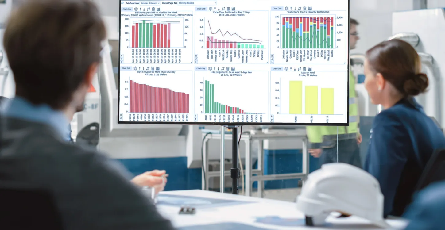
In this article, we’ve suggested ten metrics that, if kept on target, will drive towards healthy overall performance. Naturally, these metrics are available in our FabTime and/or Dashboard products. Today, you can quickly build a custom home page tab that filters these metrics to your needs. As our AI capabilities evolve, the software will do more trend monitoring and anomaly detection for you automatically, based on these same core principles. Contact us for more information.
Closing Questions for Subscribers
What do you think about these fab health metrics? Which ones are realistic? Which ones are too easy? What would you add? We welcome your feedback.
Acknowledgements
Thank you to Frank Chance, Holland Smith and Lothar Mergili for taking the time to review a draft of this article and provide feedback. Lothar’s experience as a long-time driver of fab improvement projects was especially informative.
Further Reading
See more from this issue:
For more about trade-offs between fab goals, see our recent articles about cycle time vs. cost (Issue 26.04), cycle time vs. yield (Issue 26.05), and cycle time vs. the status quo (Issue 27.01).
For a shorter article that outlines a starter set of FabTime charts for a new manufacturing supervisor, see the subscriber discussion section in Issue 21.01 in our FabTime Newsletter Archive. Our prior article about why fabs need multiple metrics is in Issue 17.03 is also available from our FabTime Newsletter Archive.
All past FabTime newsletters are available in PDF format from the FabTime Newsletter Archive. Please look for the link in the most recent email issue of the newsletter or reach out to Jennifer on LinkedIn. You can download individual issues or download a zip file containing all past issues. Some articles have been re-published on the INFICON website. Those are linked above where mentioned.
For a more in-depth discussion of how these choices apply to your site, consider hosting a session of our four-hour web-based cycle time management course.