Subscriber Discussion Forum:
FabTime Newsletter, Volume 26, No 4
We have subscriber discussion about use cases for average WIP in pareto charts and what to call time between departures in a conveyor system.

We have subscriber discussion about use cases for average WIP in pareto charts and what to call time between departures in a conveyor system. If there is a topic you’ve been wondering about, please let us know.
When should I use the regular WIP Pareto chart vs. the Average WIP Pareto chart in FabTime?
One of our INFICON team members noticed that FabTime includes both a WIP Pareto chart and an Average WIP Pareto chart and wondered about the use cases for these variants.
Response from Jennifer: Originally, FabTime used starting WIP for the WIP line on moves charts as well as for WIP trend and pareto charts. We changed this in 2011. Now, the WIP lines on the moves charts in FabTime show average WIP. Our goal with this change was to make the WIP line displayed on the moves charts more accurate, and less subject to distortion from start-of-period effects. This change also made the moves charts more consistent with the turns charts, which had previously been calculated based on average WIP.
Our next step was thinking about which value to display for WIP charts. WIP lot list charts show a list of WIP at a point in time, so have no need of an average. Standard WIP pareto charts in FabTime are also based on a single point in time, so also have no need for averages. WIP trend charts have always shown WIP at the start of each period, with the option to drill down to the WIP lot list. It made sense to continue using starting WIP here, so that when drilling down, the results would be consistent. If the data table shows 322 lots in Photo at the start of the day, and I click to drill down, I expect to see 322 lots. If I tried to click down from an average WIP value, it wouldn’t be clear which WIP list to display.
However, as mentioned above, starting WIP can be volatile between periods (especially at the tool group or operation level). We created average WIP trend charts to smooth out that variability and provide consistency with turns charts (and with the WIP lines on the moves charts). We added average WIP pareto charts for similar reasons. Unlike the standard WIP pareto charts, which are generated at a single point in time, average WIP pareto charts cover a time range. Currently average WIP pareto charts are not available in stacked form.
In all cases, average WIP can be computed using either a point-average or a time-average. A point-average is computed by dividing each period into sub-periods and computing the average of starting WIP for each sub-period within the period. People who wish to use starting WIP rather than average WIP can set the sub-period length equal to the period length, resulting in average WIP being equal to starting WIP (as the “average” of a single value, the starting WIP for the period). If the sub-period is left blank, time-average WIP is computed by summing the amount of time spent at each WIP value, then dividing by the total time.
Getting back to use cases:
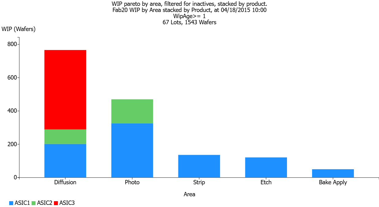
- Use the WIP Pareto chart if a particular point in time is of interest. For example, if we want to see inactive WIP by area right now, we could generate a WIP pareto chart, sliced by area, filtered to only include WIP that has been at its current operation for more than 12 hours (or whatever threshold you use to designate inactive WIP). A quick look at this chart will tell us which areas are struggling more with inactive WIP right now, and we can drill down to get a list of the relevant lots in each area. An example, also stacked by product, is shown below. Note this chart is for a single point in time.
.")
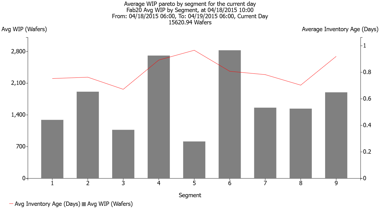
- Use the Average WIP Pareto chart to look at longer-term trends in the distribution of the WIP according to the pareto slice variable. For example, if we want to see the distribution of WIP across the line (for WIP balance), we might use the average WIP pareto chart for the current day, sliced by segment of the line. We’ll see the total WIP in each segment, averaged across the day. An example is shown below, with from and to dates for the chart covering a single workday.

What do we call time between departures on a conveyor tool?
A longtime subscriber wrote to ask: “What do we call the interval between units out? For instance, let’s say that parts take an hour to travel through a conveyor oven. They can be loaded a minimum of one minute apart. So, what would we call the one minute? I’ve always called it “takt time” even though that’s technically incorrect because takt time is based on customer demand, not equipment capability. It seems that every source online says that the one minute is “cycle time.” Yet in wafer fabs we’ve always defined “cycle time” as the time it takes for a part to travel the whole process (60 minutes in the above example). What’s your take? Given wafer fabs’ definition of “cycle time,” what would we call this one minute?
Response from Jennifer: I have not thought about the time between lots out on a conveyor system, because I don’t see that much in wafer fabs. It seems to me that your one minute is something like a load time that is required between lots. I certainly wouldn’t call it cycle time. I also don’t think of the one hour as cycle time, because when I think of cycle time, I think of it as including queue time. Cycle time is the time from when the lot arrives to the tool until it finishes processing. In your case, the lots have a process time of an hour, with something like a one-minute load or setup time between each lot. Because of the conveyor system, you do need to consider the total number of lots processed over time in assessing the capacity of the system. But I still think that the cycle time for each lot is one hour plus queue time.
If lots are processed continuously through the tool, then the time between departures will be one minute. But if the tool is sometimes loaded less frequently (e.g. it’s not run at capacity), then you’ll have longer times between departures. I’ve never heard time between departures called anything but that. Maybe you could say it’s the pace of the tool – the rate at which you can load the tool – or perhaps the cadence of the tool.
Do any other subscribers have thoughts on this question?
We welcome the opportunity to publish subscriber discussion questions and responses. Submit your responses here.
Past issues of the newsletter are available for subscribers to download in PDF format. Existing subscribers can find the archive link in your most recent email newsletter. New subscribers will see the link upon registering.
- Main article for Volume 26, No. 4: Fab Trade-Offs: Higher Cycle Time for Lower Cost
- Community Announcements page for Volume 26, No. 4


Want to learn more about cycle time drivers in your fab?
